Extensions
Nuxt.js has several extension mechanisms that can expand core functionality and add endless integrations.
Modules
- bootstrap-vue
- @nuxtjs/axios
- @nuxtjs/pwa
- @nuxtjs/style-resources
- nuxt-webfontloader
- nuxt-responsive-loader
Bootstrap Vue
With BootstrapVue you can build responsive, mobile-first, and ARIA accessible projects on the web using Vue.js. Visit website for more details
// nuxt.config.js file
modules: [
  // Doc: https://bootstrap-vue.js.org
  'bootstrap-vue/nuxt',
  // Doc: https://axios.nuxtjs.org/usage
  '@nuxtjs/axios',
  '@nuxtjs/pwa',
  '@nuxtjs/style-resources',
  'nuxt-webfontloader',
  'nuxt-responsive-loader'
],
...
// Doc: https://bootstrap-vue.js.org
bootstrapVue: {
  icons: false, // Install the IconsPlugin
  bootstrapCSS: false, // Or `css: false`
  bootstrapVueCSS: false, // Or `bvCSS: false`
  usePretranspiled: true,
  // Enable only the components you will use to keep the bundle size small.
  components: [
    'BAlert',
    'BBadge',
    'BContainer',
    'BRow',
    'BCol',
    'BForm',
    'BFormRow',
    'BFormGroup',
    'BFormInput',
    'BFormInvalidFeedback',
    'BFormValidFeedback',
    'bFormTextarea',
    'BButton',
    'BPagination',
    'BNav',
    'BNavItem',
    'BNavText'
  ]
},
Axios
Axios is a promise based HTTP client for the browser and node.js. Visit website for more details.
// nuxt.config.js file
modules: [
  // Doc: https://bootstrap-vue.js.org
  'bootstrap-vue/nuxt',
  // Doc: https://axios.nuxtjs.org/usage
  '@nuxtjs/axios',
  '@nuxtjs/pwa',
  '@nuxtjs/style-resources',
  'nuxt-webfontloader',
  'nuxt-responsive-loader'
],
...
/*
** Axios module configuration
** See https://axios.nuxtjs.org/options
 */
axios: {
  baseURL: 'https://api.example.com',
},
PWA
Progressive Web Apps (PWA) are reliable, fast, and engaging, although there are many things that can take a PWA from a baseline to exemplary experience. Visit website for more details.
// nuxt.config.js file
modules: [
  // Doc: https://bootstrap-vue.js.org
  'bootstrap-vue/nuxt',
  // Doc: https://axios.nuxtjs.org/usage
  '@nuxtjs/axios',
  '@nuxtjs/pwa',
  '@nuxtjs/style-resources',
  'nuxt-webfontloader',
  'nuxt-responsive-loader'
],
pwa: {
  manifest: {
    name: 'PhotoScope',
    lang: 'en'
  }
},
Style Resources
With @nuxtjs/style-resources you can add different css preprocessors such as sass, less,
stylus to your project.
// nuxt.config.js file
modules: [
  // Doc: https://bootstrap-vue.js.org
  'bootstrap-vue/nuxt',
  // Doc: https://axios.nuxtjs.org/usage
  '@nuxtjs/axios',
  '@nuxtjs/pwa',
  '@nuxtjs/style-resources',
  'nuxt-webfontloader',
  'nuxt-responsive-loader'
],
...
styleResources: {
  scss: ['~/assets/scss/_variables.scss'],
  sass: ['~/assets/scss/_variables.scss']
},
Web Font Loader
With the nuxt-webfontloader module, you can add web fonts such as Google's/Typekit's to your
site with the following configuration.
// nuxt.config.js file
modules: [
  // Doc: https://bootstrap-vue.js.org
  'bootstrap-vue/nuxt',
  // Doc: https://axios.nuxtjs.org/usage
  '@nuxtjs/axios',
  '@nuxtjs/pwa',
  '@nuxtjs/style-resources',
  'nuxt-webfontloader',
  'nuxt-responsive-loader'
],
...
webfontloader: {
  google: {
    families: [
      // Montserrat Webfont
      'Montserrat:300,400,500,700,900',
      // Playfair Display webfont
      'Playfair+Display:400,700&display=swap'
  }
},
Responsive Loader
With the nuxt-responsive-loader module, you can process images during the build step in your
Nuxt.js app and this will bring you many benefits. Its main features are:
- Compress images during the build step to reduce file size and improve website performance
- Generate responsive srcsets for your Nuxt.js projects
- Re-size images, convert format, rename and generate placeholders
- Enabled for JPG, PNG and WebP
// nuxt.config.js file
modules: [
  // Doc: https://bootstrap-vue.js.org
  'bootstrap-vue/nuxt',
  // Doc: https://axios.nuxtjs.org/usage
  '@nuxtjs/axios',
  '@nuxtjs/pwa',
  '@nuxtjs/style-resources',
  'nuxt-webfontloader',
  'nuxt-responsive-loader'
],
...
responsiveLoader: {
  name: 'img/[hash:7]-[width].[ext]',
  // min: 320, // minimum image width generated
  // max: 1024, // maximum image width generated
  // steps: 5, // five sizes per image will be generated
  sizes: [320, 640, 1024, 2048],
  quality: 85,
  placeholder: true,
  adapter: require('responsive-loader/sharp'),
  format: 'jpeg' // or webp
},
Plugins
The plugins directory contains your Javascript plugins that you want to run before instantiating the root vue.js application. More information about the usage of this directory in the documentation: plugins
- vue-animejs
- vue-unicons
- closable
AnimateJS
Anime.js is a lightweight JavaScript animation library with a simple, yet powerful API. It works with CSS properties, SVG, DOM attributes and JavaScript Objects. Visit website for more details.
// plugins/vue-animejs.js
import Vue from 'vue'
import VueAnime from 'vue-animejs'

Vue.use(VueAnime)
Usage: Adds a simple directive named v-anime that passes all arguments directly to anime.js
<div v-anime="{ rotate: '1turn', backgroundColor: '#FFF', duration: 2000, loop: true }"></div>
Also adds this.$anime to your components
// my-component.vue
export default {
  name: "my-component",
  data() {
    return {};
  },
  mounted() {
    const targets = this.$el;
    this
      .$anime
      .timeline()
      .add({
        targets,
        translateX: 250,
        easing: 'easeOutExpo',
      })
      .add({
        targets,
        translateX: 250,
        easing: 'easeOutExpo',
      });
      /* ... etc ... */
  },
}
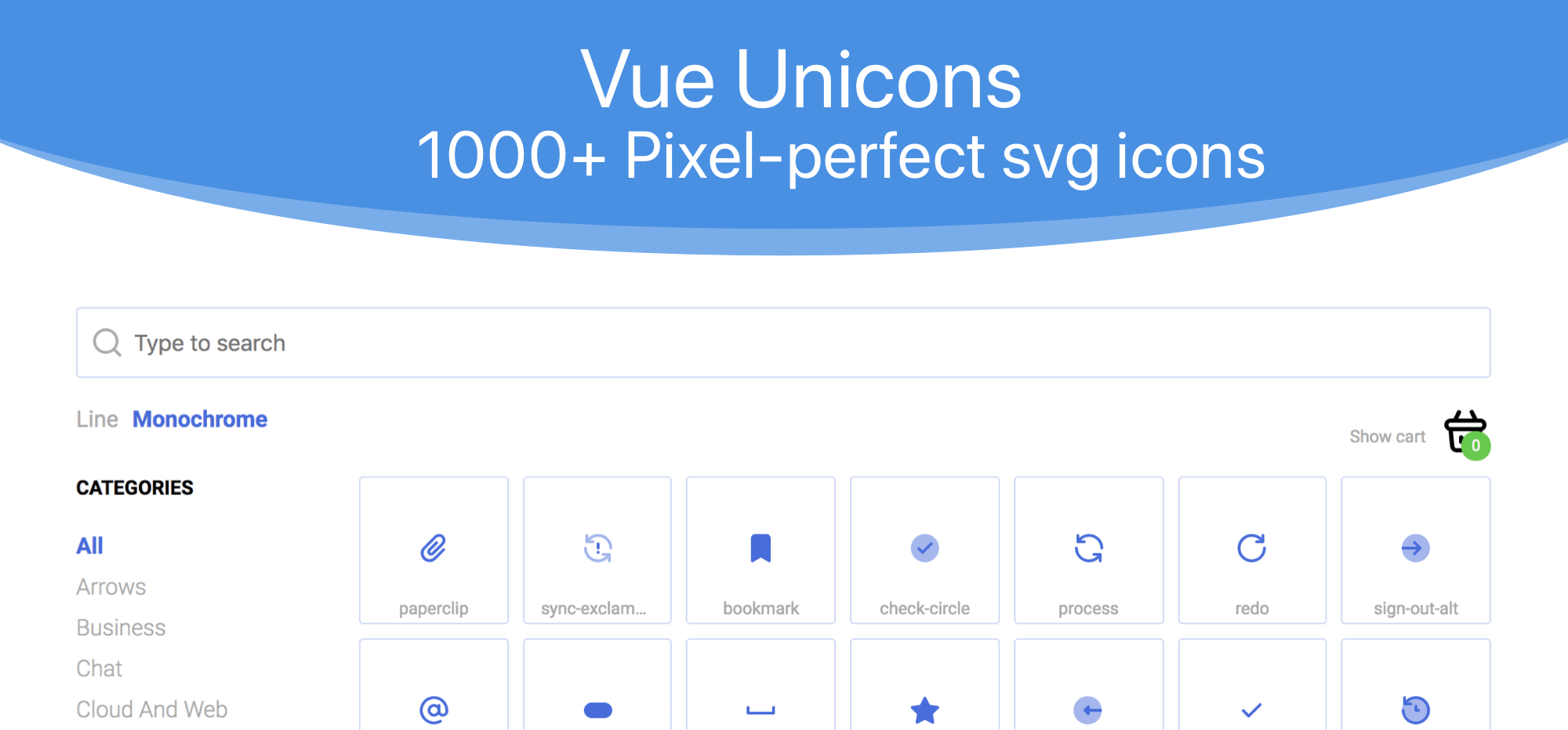
Unicons
1000+ Pixel-perfect vector icons and Iconfont for your project. Visit website for more details.
// plugins/vue-unicons.js
import Vue from 'vue'
import Unicon from 'vue-unicons'

// Use https://antonreshetov.github.io/vue-unicons/ page for icon selection

import {
  uniArrowDown,
  uniArrowLeft,
  uniArrowRight,
  uniArrowUp,
  uniAt,
  uniClock,
  uniCommentMessage,
  uniDocumentLayoutLeft,
  uniEllipsisH,
  uniFacebook,
  uniHomeAlt,
  uniImages,
  uniInstagram,
  uniLinkedin,
  uniMapMarker,
  uniPause,
  uniPhone,
  uniPlay,
  uniStarMonochrome,
  uniStore,
  uniTwitter,
  uniUserSquare
} from 'vue-unicons/src/icons'

Unicon.add([
  uniArrowDown,
  uniArrowLeft,
  uniArrowRight,
  uniArrowUp,
  uniAt,
  uniClock,
  uniCommentMessage,
  uniDocumentLayoutLeft,
  uniEllipsisH,
  uniFacebook,
  uniHomeAlt,
  uniImages,
  uniInstagram,
  uniLinkedin,
  uniMapMarker,
  uniPause,
  uniPhone,
  uniPlay,
  uniStarMonochrome,
  uniStore,
  uniTwitter,
  uniUserSquare
])
Vue.use(Unicon)
Usage:
Use the name of icon without the uni prefix, icon style and in the kebab-case:
uniCarWash -> car-wash
uniLayerGroupMonochrome -> layer-group
<template>
  <div>
    <unicon name="car-wash" fill="limegreen"></unicon>
    <unicon name="layer-group" fill="royalblue" icon-style="monochrome"></unicon>
  </div>
</template>
Closable
Closable plugin is help to detect clicks outside an element in Vue. For example, we will use this plug-in to close a popup menu by clicking anywhere on the page.
// plugins/vue-closable.js
// https://tahazsh.com/detect-outside-click-in-vue
import Vue from 'vue'

let handleOutsideClick

Vue.directive('closable', {
  bind(el, binding, vnode) {
    handleOutsideClick = (e) => {
      e.stopPropagation()
      const { handler, exclude } = binding.value
      let clickedOnExcludedEl = false
      exclude.forEach((refName) => {
        if (!clickedOnExcludedEl) {
          const excludedEl = vnode.context.$refs[refName]
          if (excludedEl)
            if (excludedEl.$el) {
              clickedOnExcludedEl = excludedEl.$el.contains(e.target)
            } else {
              clickedOnExcludedEl = excludedEl.contains(e.target)
            }
        }
      })
      if (!el.contains(e.target) && !clickedOnExcludedEl) {
        vnode.context[handler]()
      }
    }
    document.addEventListener('click', handleOutsideClick)
    document.addEventListener('touchstart', handleOutsideClick)
  },

  unbind() {
    document.removeEventListener('click', handleOutsideClick)
    document.removeEventListener('touchstart', handleOutsideClick)
  }
})
Usage:
<template>
  <div id="app">
    <button
      ref="button"
      class="toggle-button"
      @click="showPopup = !showPopup"
    >
      TOGGLE
    </button>
    <div
      v-show="showPopup"
      v-closable="{
        exclude: ['button'],
        handler: 'onClose'
      }"
      class="popup-box"
    >
      Test Popup Box
    </div>
  </div>
</template>

<script>
export default {
  data () {
    return {
      showPopup: false
    }
  },
  methods: {
    onClose () {
      this.showPopup = false
    }
  }
}
</script>